How effective is the combination of your main Product and Ancillary Texts?
When we were creating our media product, discussing our branding and ancillary texts we wanted to make sure there was a main theme throughout all of our work. One way to make your products successful is to make sure there is something very significant about it; this will allow people to remember the film and the products allowing you to stand out above other competitors and products.If you do this correctly the iconic image will become more well known which means the film would be a lot more popular adding value to it. The significant part of your film can be anything; it could be a prop, a setting, the logo, font or even a persona .
Iconic Image
|
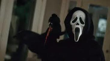
Scream:
One of the most iconic images in the horror film industry is the use of the mask in the film Scream, which was released in 1996. This mask is so significant and iconic it is instantly recognised as the killer in the Scream films. As the mask got more and more popular it was used to promote the rest of the sequels which has therefore made it one of the most recognisable franchises in the horror industry. This is one of the reason we wanted to make sure we created an iconic image in our film and products; it would allow it to be recognised and remembered. |
|
Iconic Texts
|
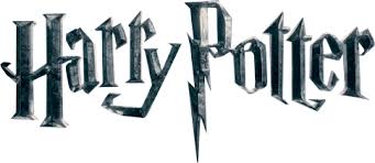
Harry Potter:
Harry Potter is an incredibly iconic font and famous franchise; the font is an example if where the font is able to represent the main brand of the film. Adding to this the title is the main characters name; this shows the audience that he is incredibly important to the film over the other characters.Finally the main key part of the title is the "P" it has been made to look like the lightning mark of Harry's forehead. |
|
|
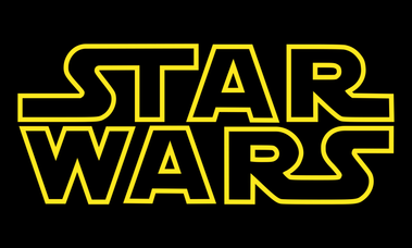
Star Wars:
When Star Wars was first released it shocked the world which instantly got people and fans hooked; this lead to Star Wars merchandise being essentially everywhere. This meant that the brand was constantly viewed. The font used for the film "Star Wars" has become so iconic that nearly everyone is able to recognise it even if they have never even watched the films. This is one of the reasons we wanted to keep our font quite simple as we thought it would work a lot better than over complicating things |
Iconic Posters
|
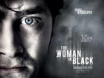
The poster from "The Woman In Black" has a very significant image which shows a close up of Daniel Radcliffe's face. As his face is the close up it can show the audience that he is perhaps the main character and the victim in the film. His facial expression is quite dull and his face has been made to look quite pale; this could represent that he is feeling quite scared and vulnerable.
The poster also includes a blurred out face that is fading into the background; although it is not a clear image of someones face which shows mystery and fear which will give a massive impact on the audience. |
|
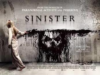
Another recognisable poster that includes an iconic image is the film "Sinister," which was released in 2013. Although the image isn't giving a lot of information away, it is still able to be easily recognisable by people. The background of this poster is quite dull and plain which allows the paint and the girl to stand out; however it is not completely plain as it has cracks and dirst in the corners which makes it look like an old fashioned room or building.
The paint on the wall is a way of representing death and mystery; it could also demonstrate the idea of someone being possessed. The fact the little girl is wearing white shows that she could be innocent and vulnerable which shows a harsh contrast between her and the face against the wall. |
|
|
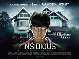
Insidious is an extremely recognisable poster this is because it is so unique and can only be linked with this particular horror. The poster clearly shows a possessed young boy with a unusual looking house in the background. The slogan on this poster is just as important as the image, "It's not the house that's haunted," this is because it is able to give the audience extra knowledge about the film. It tells the audience that what is going on in the house is all because of the possession that is held over the family and their child.
Adding to this the font used is very simple; as a group we noticed this seemed to be a trend in horror films. It is normal to see quite simple or plain fonts on horror posters; this is so the focus isn't completely taken away from the images. |
Iconic Magazines
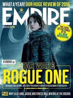
Empire is a well known magazine that is able to provide different news stories, reviews on recent films and what the upcoming films will be.
In this particular magazine cover they are clearly going to be focusing on the new "Star Wars" film "Rogue One." They have kept the photograph quite simple but direct to the film that is going to be spoken about throughout the issue. They do this through the use of the main character and the death star which is faded into the background; these are key elements to the film.
They have stuck to a clear colour scheme of yellow and white; the use of yellow is effective because this is the colour of the "Star Wars" logo. Therefore the magazine cover shows a strong representation of the film series.
The Original Picture |
Final Poster |
|
|
|
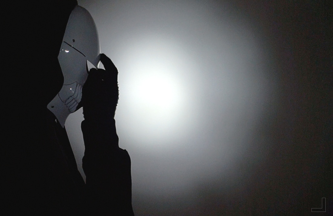
The original photograph we took in a simple and basic room trying to keep it a black background; we then set up the camera so it would be able to take a mid shot of the mask being placed against the killers face. To make parts of the shot brighter we placed a bright light in the angle of the middle of the camera which then meant it would only cover small amounts of the screen.
We wanted to make sure the mask stood out which is why we made Brandon wear a black hoodie; this would allow the mask and the bright light to stand out a lot more. As a group we wanted to keep the original image simple in order to allow us more development when it came to editing and adding our text. |
In order to achieve our final product we had to edit our image to increase contrast and brightness; we wanted to increase the contrast in order to make the white stand out a lot more than the black. When doing this we found that it made the mask blend in a bit more but not too much so it was still able to be enhanced over everything else.
We didnt want to change too much of the original image because we wanted to keep it quite simple and not too overpowering against everything else; we wanted to make sure everything fitted together and all colours and affects were able to blend. |
Our original picture |
Final Magazine |
|
|
|
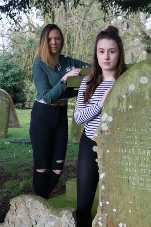
The location we used for our original photograph was the local graveyard; we thought this would be a good location to use because most of our trailer is focused in this area. We also wanted to make the victim appear in front of the killer to show the contrast in roles and to show which one of them is dominant.
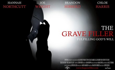
As the title of our trailer is " The Grave Filler" we decided to have the killer and the victim leaning of different gravestones; we thought this would look different compared to other typical magazine covers that show blood and death. We also wanted to make the photograph much brighter than a typical horror; we were hoping this would allow us to easily edit the image and make the text simple. When taking the photo we wanted to make sure there is more background around the main focus; this is so we could easily edit text around it without covering up too much of the people on the magazine. |
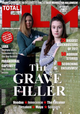
In order to achieve our final magazine we tried to keep it effective but simple. We were hoping that by keeping our magazine cover simple it wouldnt over complicate our trailer. We also didn't want the magazine cover to tell too much about what is going to go on in our trailer; we thought by doing our magazine in this particular way it wouldnt take too much away from our trailer.
For our text we decided to use the same font as we did on both our trailer and our poster; this meant we could link everything together and it would make it look a lot more professional than if we used a variety of different fonts. This also links in with the colours we decided to use; we kept it simple, red and white. This was the exact same colours we used on our magazine making it look much more professional and doesn't make it look childish and silly. In order to make our faces stand out on the magazine we blurred out the trees that were in the background; this took the focus off the background and brought our faces to the forefront of the magazine. |
-HN
Innocence
Original Picture |
Final Multimedia Poster |
This is the original picture that I took for the poster. At the same time I also took a clip that appears in the trailer of the killer putting on the mask. This iconic image was the main piece of branding that I wanted to use. Aspects of the picture that make it effective is the colours, lighting and actions. The colour scheme is dark and gloomy. This will give a feeling of a sinister atmosphere which highlight the main environment of the film. The lighting on the room is also effective as it gives a rule of thirds within the photo which attracts the audience's attention to the mask which will once again increase the brand identity. Finally, I have also mentioned the action to be an effective element. I believe this as the action is of the killer placing the mask over his head to be obscure. This action highlights what the darkened object of the mask is and also symbolises the it hide the killer not just physically but also mentally which will create interesting scenes within the story.
|
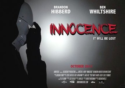
Adding text to the images created my multimedia pieces which I used as a poster to advertise the film. All of the text has been aligned on the right hand side of the poster making sure that the rules of thirds from the main image in still in play. Doing this also ensured that the mask which was the main piece of branding was still visible to be seen. Once again this would increase the brand identity and would start to develop the iconic image. As well as the iconic image of the mask I have also tried to interpret another icon for branding identity with the title of 'Innocence'. This would be a another effective branding piece because of the highlighting colour of red which is symbolic for blood within the slasher. It also has faded edges around the characters (letters) of the title which can be symbolic for the people in the film fading away and losing their chance to have a peaceful life. Finally, the dark shadow behind the title oversees the darkness that is coming. With two highly good brand identities there is likely to be a bigger fandom and also an overall more successful project.
|
Original Picture |
Final Multimedia Magazine |
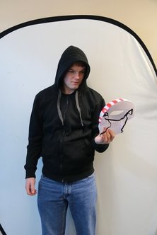
This is the image which was taken for me to use for my magazine. To stick with the main branding identity I wanted for my film I made sure to include the mask. I also made sure that I had a darkened outfit so that I could blend into the surroundings which would highlight the branding image. In the picture I ensure that I was looking at the mask which would once again increase the iconic image because people would automatically follow the direction which I would be looking at. Moving away from the main iconic image the jeans in this image would not fit into the atmosphere of the film, however in editing the picture would be cropped. The full white background also gave me the options to add different technical features. This means that I could have used it as a alternative green screen and place an image above it that linked into my story. Finally, the hoodie could also be seen as an iconic piece of clothing as the killer is wearing it generally through the film and advertisement. This is because of the dark colour which will allow them to blend into the shadows allowing him to stalk his victims.
|
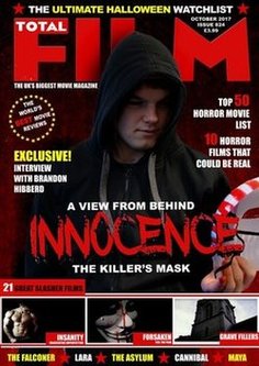
Using multiple different images and text allowed me to create my multimedia magazine cover which would be used to advertise my film. This cover had many different professional features that would be included such as images/ advertisement for other films included inside, slogans and price. To relate this cover to my film I included icon images and also other features such as text ("Interview with Brandon Hibberd"). The first iconic images is the original base image shown on the left. This included the dark hoodie which is able to blend into the non-distracting background and also the mask that will once again create this brand identity around the prop. As well as the image I have also included the title which is the same in the poster and trailer. Having this with the colour is very effective in this cover as it is general red. This gives a horror feel of blood and is good for my slasher.
|
Conclusion
|
To conclude I can see three iconic multimedia pieces that have been used throughout my advertisement and in the film. Firstly, the title is included in all of them and has a very unique style of a fading shadow behind it. This could catch on as a brand recognition such as 'Harry Potter' title. The second iconic image that could be seen in of a jumper. Although less aim at my horror and generally used, this dark hoodie relates to the character and is always wore when he is seen. It is able to hide the character and keep him obscure through the film. Finally, the mask is the most iconic image in my film. It is very unique with the red lines across and is highlighted in most of my advertisements such as the magazine where the story is based around it. This prop is most likely to become most successful as a brand identity for my film.
Overall with one brand identity or having all of them will increase the popularity of my film and will make it easier for people to remember it which will make it a successful project. |
|
-BH
