Before making our own movie poster we decided to take on the task of analysing some that have already been made to find out how we can make ours appealing and appropriate to our target audience.
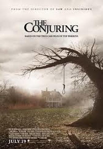
An example of a horror movie poster:
|
'The Conjuring' is an American supernatural horror film made in 2013. it was directed by James Wan and written by Chad Hayes and Carey Hayes. The film is the first installment in 'The Conjuring' film series. The film stars Patrick Wilson and Vera Farmiga, they play Ed and Lorraine Warren, paranormal investigators and authors associated with prominent cases of haunting. Their reports inspired The Amityville Horror. The Warrens' come to the assistance of the Perron family (Ron Livingston and Lili Taylor), who are experiencing increasingly disturbing events in their farmhouse in Rhode Island in 1971.
'The Conjuring' was released in the United States and Canada on July 19, 2013, and in the United Kingdom and India on August 6, 2013. The film received positive reviews from critics and grossed over $318 million worldwide from its $20 million budget, making it one of the highest-grossing horror films of all time. A sequel, 'The Conjuring 2', was released on June 10, 2016, also to critical and commercial success. -Wikipedia |
- The title of the film is the biggest text on the page and is at the top of the page in dark writing on a light background.This has been done so that name of the film stands out more than anything else and so that the title is the first thing that the audience will see.
- Having a slogan underneath the title makes the audience more curious about what they film's about, therefor the will be more likely to go to the cinema and watch it or buy the DVD.
- The scary image of the tree and the house and the mist also arouses curiosity for the audience of the poster because it makes them wonder what happens in the film. Because it's scary it also will stick in the audience's head more than an image that isn't.
- the minimal writing may interest more visual members of the audience, however, others may dislike this because the poster doesn't give any details about when the film is coming out or what cinema it's going to be shown in.
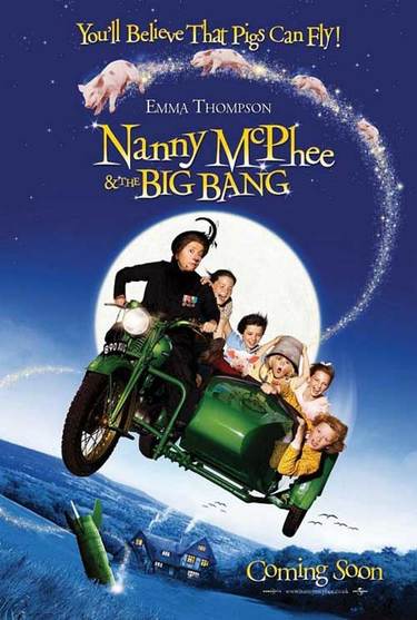
An example of a children's movie poster:
|
'Nanny McPhee and the Big Bang' (released in the United States and Canada as Nanny McPhee Returns) is a 2010 fantasy/comedy family film directed by Susanna White, produced by Tim Bevan, Eric Fellner and Lindsay Doran. it has music by James Newton Howard and co-produced by StudioCanal, Relativity Media, Working Title Films and Three Strange Angels. It is a sequel to the 2005 film 'Nanny McPhee'. Emma Thompson reprises her role as Nanny McPhee, and the film also stars Maggie Gyllenhaal, Ralph Fiennes, Rhys Ifans, Ewan McGregor, Maggie Smith, Asa Butterfield, Bill Bailey and Katy Brand. The film was theatrically released on August 20, 2010 by Universal Pictures.
The film received positive reviews from critics and it earned $93,251,121 on a $35 million budget. It also received a Young Artist Award nomination for Best Performance in a Feature Film. The film was released on DVD and Blu-ray in the UK on 19 June 2010. -Wikipedia |
- The slogan 'you'll believe that pigs can fly!' helps the audience to associate the film with magic and excitement because flying pigs aren't real. This would make children excited about the film and make them want to watch it.
- The words 'coming soon' also build excitement and anticipation for the audience because they will be excited to know the exact date and see it in cinemas. However, similar to the 'The Conjuring' poster, some people might be a bit put off of the film by the lack of information given on the poster. An exact date might have been helpful, especially because the target audience of this film would be children who aren't old enough to pay for and arrange their own cinema tickets.
- Showing that the film stars Emma Thompson is also a good way to advertise the film because people will go see it because of who is in it.
- Having the character of Nanny Mcphee in the centre of the poster is also a good way to attract the target audience's attention because Nanny Mcphee is a recognisable, household character and her face will be memorable after the success of the first film.
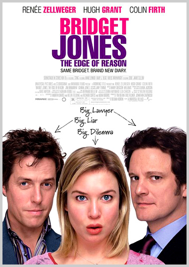
An example of a comedy poster:
|
'Bridget Jones: The Edge of Reason' is a 2004 British-French-American romantic/comedy film directed by Beeban Kidron, based on Helen Fielding's novel of the same name. It stars Renée Zellweger as Bridget Jones, Colin Firth as Mark Darcy, and Hugh Grant as Daniel Cleaver. It is the sequel to 'Bridget Jones's Diary' (2001). -Wikipedia
|
- The slogan on the poster is 'same Bridget, brand new diary'. This makes the film appealing to it's target audience because Bridget Jones is another well-loved character from previous books and a previous film. it implies that the lovable character is staying exactly the same but there's a new and exciting storyline.
- Listing the most famous actors featuring in the film at the top of the poster also successfully sells the film because people will pay to see the film because they are fans of the actors starring in it.
- Showing the title of the film in pink and purple on a white background links to the film's more feminine side and also implies the film will be bright and fun. This shows that when we make a film poster for our Horror trailer, we probably should avoid bright colours that connote fun and excitement.
Our poster:
- Our poster colours need to link with the genre of our film
- Our poster needs to have the title of the film in large writing
- Our poster needs to be informative when it comes to the date the film is being released in cinemas or on DVD
- Our poster needs to have a relevant, eye catching image
- Our poster needs to have minimal writing in order to ensure the target audience's attention isn't detracted from the key (most memorable) bits of the poster like the release date, the title and the main image.
Our Finished Poster:
-CH
