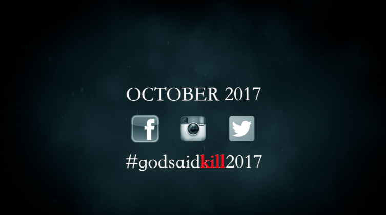
As a group we decided to have our final shot as the date the film will be released. We thought that this would be best to have at the very end of our trailer because then it could be remembered and it would be the last thing the audience will see. On this page we wanted to make it quite simple but still have bits that would essentially stand out above the rest. Having this page at the beginning of the trailer would mean that what was written would be forgotten as the trailer goes on.
|
Social media
It is important to put all types of media in this last shot; this is so the audience know what social media the trailer is a part of. This will allow audience members to follow social media to keep them updated on all the gossip and news about the upcoming film and the actors. Having social media on there will essentially create more publicity for the trailer hopefully making it more successful when the film comes out. We made the social media icons slightly blend in with the background and put an effect over the top of them; this is because even though social media is important in the industry the main point of this shot is to present our hashtag and the date of the upcoming film. As our audience target was teenagers and young adults we only wanted to show the icons of the most popular social media sites; this included Instagram, Facebook and Twitter. These are the sites that would allow us to publish the trailer and eventually start a trend with our hashtag. |
|
|
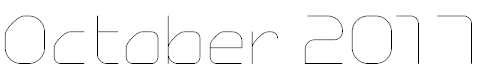
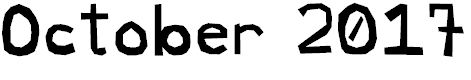
Date
It is very important to include the date in all advertising of the film, this is so it makes it clear to the audience when the film will be released. We didn't want the font to over complicate the shot so we went for a simple font in the colour white which allowed it to stand out over the dark background. We also didnt want to use an extremely large font because then it would completely over power everything else in the shot and this is the complete opposite to what we initially wanted to achieve. This is another reason why we placed the date in the middle of the shot; we wanted that to be the main point and something for the audience to remember. |
|
Hashtag
The key part of having a hashtag is to get people talking about your "product;" it is important that people talk about the trailer because word of mouth and social media are the two main things that help make a film successful. Without the support of social media members and followers no film would ever make enough money and profit. It is also important that our hashtag is something interesting so it will easily be remembered;if we have a memorable hashtag then it will stick in peoples heads. We wanted to make sure that our hashtag stood out; this is why we did it the same font style and size as we did the date of the movie release. If we did not do this the shot would look muddled compared to everything else and wouldn't look as professional. The main part of the hashtag we wanted to stand out was the word "kill" this is when we decided to do that word in red; this represents danger and death which is one of the main themes throughout our trailer. |
|


|
The Font
The Bad Times St - We decided that this particular font didnt give us the correct feel we wanted to come across; the font seemed scratchy and much more eerie whereas we wanted the date to be shown more simply but still stand out Typo Angular Demo - This font we looked at because it was a lot more simple; however we felt that it looked too science fiction not horror. It is a lot thinner and taller than other fonts which didn't look right on our shot. KonKhmer_S-Phanith2 - This particular font we agreed would be a lot better for a title for a slasher film rather than the date on our final shot; we believed it was a bit too detailed and too overwhelming to have in the middle of our last shot. Stars World - It is obvious this is not the font we would include as the title of the movie release; it is much too childish and doesnt give any kind of horror feel to it. This font would contradict the emotion that we wanted to create throughout our trailer. Brynda1231 font - Although this font is a lot simpler than other fonts we were looking at previously we thought it was still a lot bolder and darker than what we had in mind. Also we didnt like how there was a line through the 0; this is because it made the writing look more suitable for a cartoon. Kaiti SC - This is the font we went with for our title; eventually we thought it would make our trailer look a lot more professional is we kept all the fonts the same throughout; Also it is a simple font but still not completely dull, it will stand out on a black background and this will allow the audience to be drawn to it. |
The Background
It is important to make sure that the background isn't too detailed because otherwise the main focus wouldn't be on the information being given; this is why we decided to go for a dark background that looked slightly lighter around the writing. By using a dark background it allowed us to put text into lighter colours to make them stand out and be the main focus of the shot.
It is important to make sure that the background isn't too detailed because otherwise the main focus wouldn't be on the information being given; this is why we decided to go for a dark background that looked slightly lighter around the writing. By using a dark background it allowed us to put text into lighter colours to make them stand out and be the main focus of the shot.
What haven't we included?
Our website
As a group we decided that just including the date, hashtag and social media would be enough to help advertise our trailer; if we added a website name it would make the shot look more complex and too full to have as a final shot. Adding to this the target audience we chose would most likely be more interested in the social media side of things rather than looking at a particular website; this is mainly because social media is very easy to use and will be used almost every day. This will do a lot more advertising than if we were to just place the website on the final shot. Also a website would just say what the producers and directors of the film have to say about it, however social media will have everyone who has watched it talking about it; if the feedback is good it is more likely that the film will make more money and be a lot more successful.
Bright colours
If we decided to use bright colours on our final shot it would contradict the whole trailer; it would not give the same emotions and feelings we have been trying to create throughout the rest of the trailer. We felt this would completely destroy the trailer and would make it unprofessional; we wanted the colours to link with the trailer we had produced and if we used lots of bright colours it would make the film seem more of a joke than a serious horror.
Images
Images are not important when it comes to the final shot of the trailer; what we wanted the audience to see we have shown them throughout the trailer. The trailer is what tells the story, its what gives the audience hints of what might happen and it will make them question the film. If we included images on these particular shots instead of using a plain coloured background we felt it would make our trailer seem more like a powerpoint than a short trailer; this would also equal in it looking unfinished and complicated which would take the main focus away from the hashtag and the date of the film release
Cast members
We felt that we didn't have to include any cast members on our final shot because they would normally be show overlaying particular shots throughout the trailer. If we had put all cast members on the trailer it would make it much duller and boring for the audience as there would be lots of titles and writing; this is not what we wanted. We also thought that including cast members throughout the trailer isn't as important; as this would be clearly shown when it comes to our posters and magazines which means that it shouldnt be the main focus of our final shot.
Title
There was no need to include the title in our final shot because we had included it in the shot before and we didnt want to keep repeating it; this would make it look unprofessional and there was really no need for it. Again the title will be shown in all sorts of advertising and we had also mentioned it previously.
Adding to this the title is the most important point of the trailer; it is what needs to be remembered and is what will be mentioned throughout all social media sites this is why we did a separate shot for it where we made the font a lot larger and bolder than other titles that show up in the trailer.
-HN
