Having the correct font is crucial to create the right atmosphere for a trailer. If you have lots of effective shots within your trailer that emphasise the horror and gore, and then match that with a comedic looking, cartoon font, then it will bring down the quality of the trailer overall. Here are some examples of fonts and why they would not suit our trailer:

|
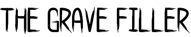
Star World Font:
Although this is a very interesting font, it is not suited for a horror trailer and would not make for an effective title screen. Using this font would throw off the balance between the shots and the text, and bring down the quality of the overall trailer. A font like this would best be suited to a comedy or a children's programme. |
|
The Bad Times:
This font could pass for an effective horror trailer font, with the broken edges it almost looks like it could be painted on and if you change the colour to red it would very well represent blood painted onto the screen. However, we didn't think it would best represent our trailer and wanted a smoother font for our trailer. |
|
Typo Angular:
This font would look better in a sci-fi movie trailer rather than a horror, It looks like your typical computer font and would make more sense alongside shots of futuristic events and action. Therefore it would not be suitable for a slasher movie trailer like ours. |

|
Jelly Wobblers:
This font also seems quite comedic and would not suit a horror very well. Alongside shots of blood and gore, this would confuse the atmosphere and make the trailer overall, less effective. |
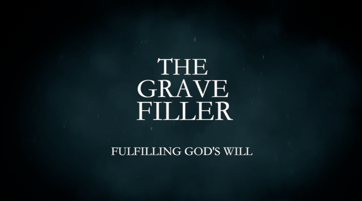
Trailer
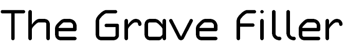
For our trailer, we decided to use a simple font to make sure we didn't over complicate the text and so that it is easier for the audience to read as the trailer is playing. We went for 'Kaiti SC' for our font as it is simple and we sized it quite large to make it stand out from the background, we also coloured it white to create more emphasis around the letters and make it easier to read. We used the same font throughout all of the text slides in the trailer because, as I said before, it is easy to read and we didn't want to over complicate the post-production process by playing around with fonts when we should be spending more time on the quality of the shots and editing them together in the correct order. We have included our tagline on this screen also and sized it smaller than the title so it doesn't draw all of the attention away from the main focus.
We took inspiration from some different trailers with our fonts and layouts, here are some examples:
|
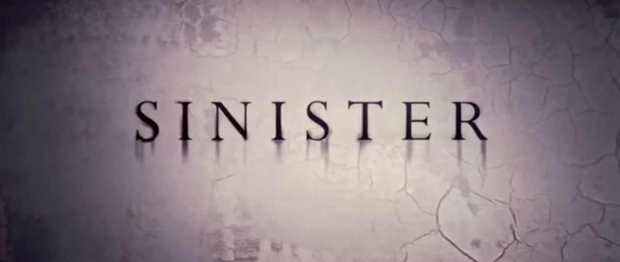
Sinister:
We took inspiration from the contrasting text and background in this one, we decided at the beginning that we wanted to have a dark background for our title screens and so when watching other trailers such as this one, we decided using a contrasting coloured text would be a good option to make it look professional and high quality. The font in this trailer is very simple and easy to read which influenced us when picking our own font because we preferred trailers with the more straightforward fonts rather than the more complicated fonts. |
|
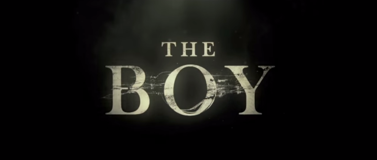
The Boy:
Again, another uncomplicated font which gets the point across and is clear to make out with the light colour against the dark background. Using a basic font ensures that the focus is one the shots and quality of the editing rather than the title screens, which is what you want when creating a trailer. The text is centred on the screen as to not obscure the writing and create an effective title screen. |
|
Poster
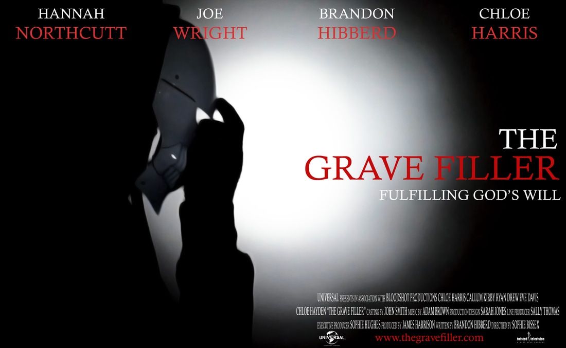
We decided to go for a simple font for our poster as well because we thought it would represent / advertise our trailer well and we thought it would confuse the overall effect we were going for if we used a really different font from the trailer on the poster. The font we decided to use is called 'Calisto MT' which is very similar to the font that was used in our trailer.
We decided to change the sizing regularly between the different sections of text because we thought it would make it look a lot more professional than having everything the same size. We had the first names of the actors a fraction smaller than their last names and gave the same effect to the title with 'The' being a fraction smaller than the 'Grave Filler.' We used hints of red throughout to represent the death within the trailer, and we had to shrink down the font of the credits after typing it out so when it is printed it will be a reasonable size in proportion to the rest of the poster.
We decided to change the sizing regularly between the different sections of text because we thought it would make it look a lot more professional than having everything the same size. We had the first names of the actors a fraction smaller than their last names and gave the same effect to the title with 'The' being a fraction smaller than the 'Grave Filler.' We used hints of red throughout to represent the death within the trailer, and we had to shrink down the font of the credits after typing it out so when it is printed it will be a reasonable size in proportion to the rest of the poster.
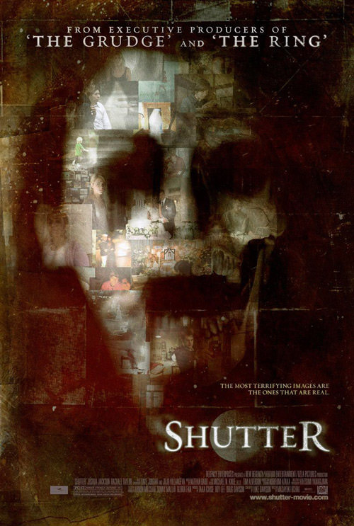
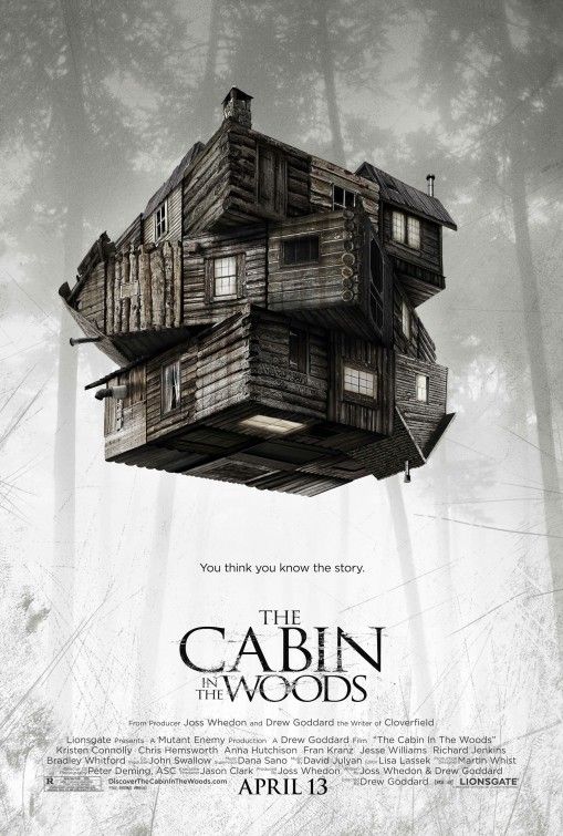
Below are the inspiration posters for our font choice, these posters focus more on the quality of the image and the composition rather than the font which is what makes them so appealing. They all have pretty similar fonts but still look completely different from one another, which shows how a good image is the main selling point for a good poster.
|
|
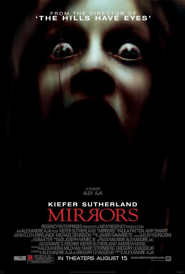
|
Magazine
|
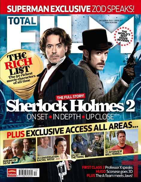
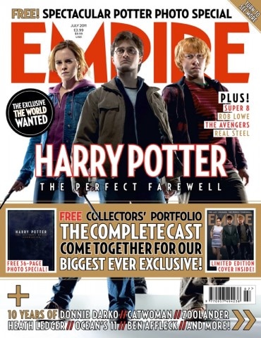
We made the fonts for the magazine clear as well as the main purpose of the magazine cover is to draw people in and get them to read it. We took inspiration from our poster when picking the extra fonts, and for the main title of the magazine, we made it look like your stereotypical magazine cover font as to not challenge your conventional magazine cover.
We didn't want to stray too far from a conventional magazine cover because we wanted it to look like it has been professionally done, so we used other magazine covers as inspiration and used a template, so that the text had the correct placement on the image to create a high quality piece of work. We also took some inspiration from previous year groups to get the idea of what looks the best, and some mistakes people may have made previously, as to not make those mistakes ourselves. |
|
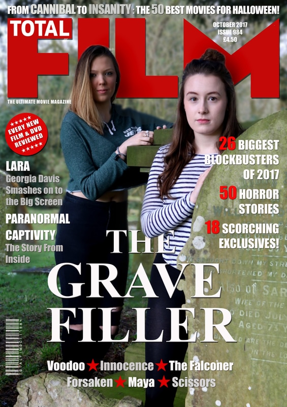
Here are some magzine cover we looked at for inspiration when planning our font and layout:
|
|
|
|
- SB
